Is Twitter Rebrand a Glimpse at the Future of Design?
The CMO at Twitter, Leslie Berland, has announced[1] a substantial rebrand intended to reflect the experience of using the site. The move was announced on the platform first and later confirmed on its blog[2].
Twitter hopes the visual identity will “fully reflect the complexity, fluidity, and power of the conversations today.”
The instantly recognizable bird logomark stays, as does the inoffensive tech-blue. But everything else has been grunged up.
rather than build the system up from each component part or build around a specific element, we embarked upon building a creative design system that’s intentionally imperfect
— Donna Lamar, Global ECD, Twitter
There’s a brand new custom typeface named “Chirp” designed in collaboration with Grilli Type[3]. It mixes features of gothics and grotesques with hipster-friendly quirks and replaces the decidedly corporate Helvetica.
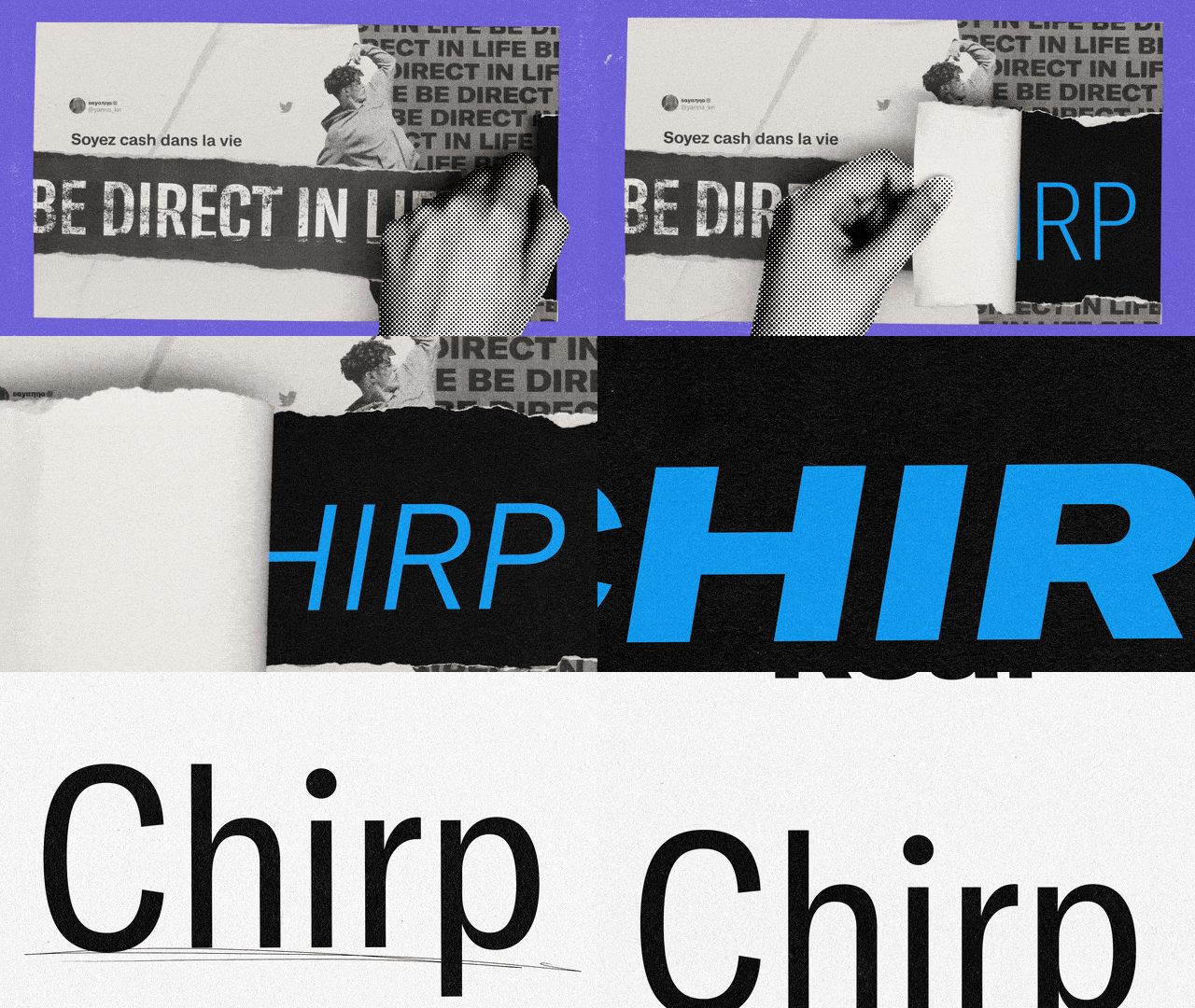
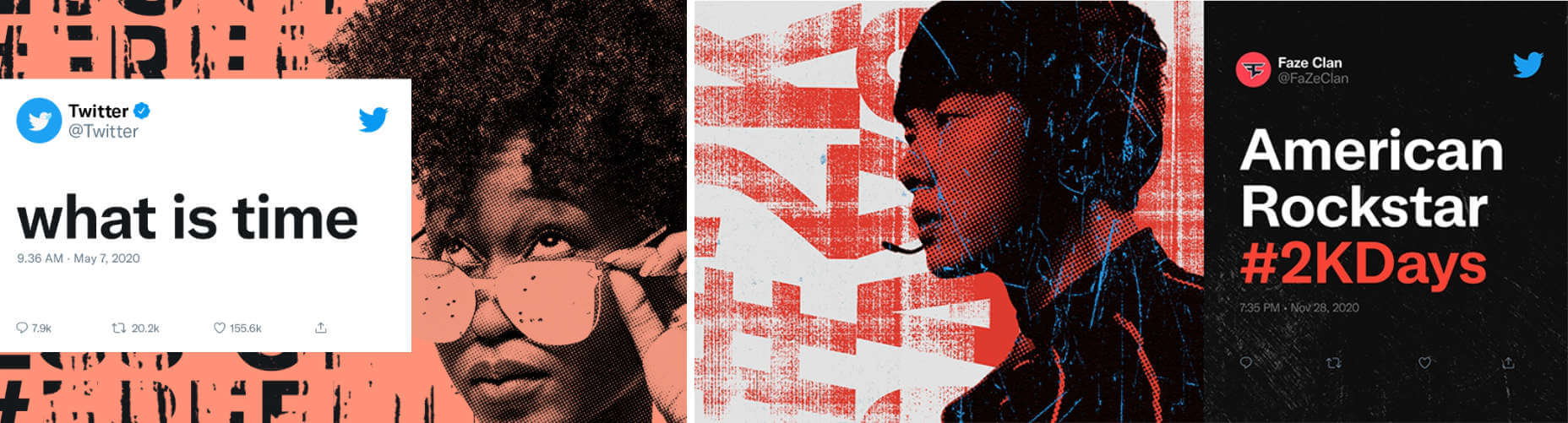
The most visually arresting elements are the print-inspired collages, faux-print effects, and distress marks. It’s a move away from the safe, minimal style that has dominated the design industry for more than a decade.
There are layers of bill posters torn off in pieces revealing text beneath, macroscopic views of people, and an all-pervading effortless cool. Think Paris, on a Sunday morning, circa 1997.
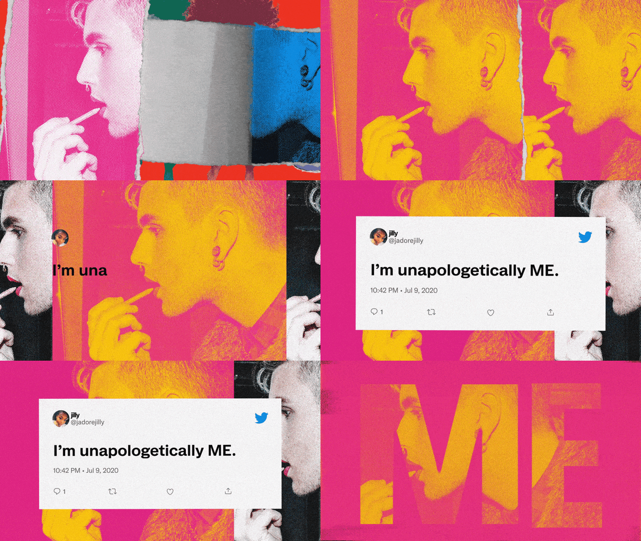
It’s exciting to see a major brand strike out in a new direction, particularly one that isn’t Google-derived. There’s plenty of energy in the new artwork, but it doesn’t escape notice that this is a surface level restyle; the core design remains.
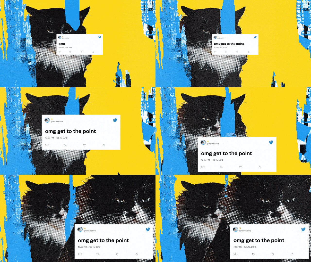
Is this a glimpse of design over the next few years: a braver, irreverent, and decidedly less-corporate style of corporate design? Or, a misstep we’ll all forget as soon as Material Design 3.0 is released?
References
- ^ has announced (twitter.com)
- ^ confirmed on its blog (blog.twitter.com)
- ^ Grilli Type (www.grillitype.com)
Powered by WPeMatico